Creating a project management graph typically involves selecting a suitable chart type like Gantt or network diagrams, entering project tasks, durations, and dependencies, then using software or drawing tools to visualize the project timeline and task relationships.
Visualizing your projects can seem daunting, but it doesn’t have to be. We often get asked about how to make project management graph, and the answer is simpler than you might think. There are various tools and methods available to help you achieve this.
Understanding how to effectively represent project data is crucial for planning and tracking progress. These graphs offer a clear picture of project timelines and dependencies. This helps keep everyone on the same page and lets you better see the overall status of a project.

How to Make Project Management Graphs
Let’s dive into the exciting world of project management graphs! These visual tools help us see how projects are going, what tasks need to be done, and when things should be finished. Think of them like maps for your projects, making sure everyone stays on the right path. You might have heard of different types, like Gantt charts or network diagrams. We’re going to explore how to create these, making even the most complicated project seem clear and manageable. Making a good project management graph isn’t difficult; it’s just about knowing what to include and how to organize it.
Understanding Project Management Graphs
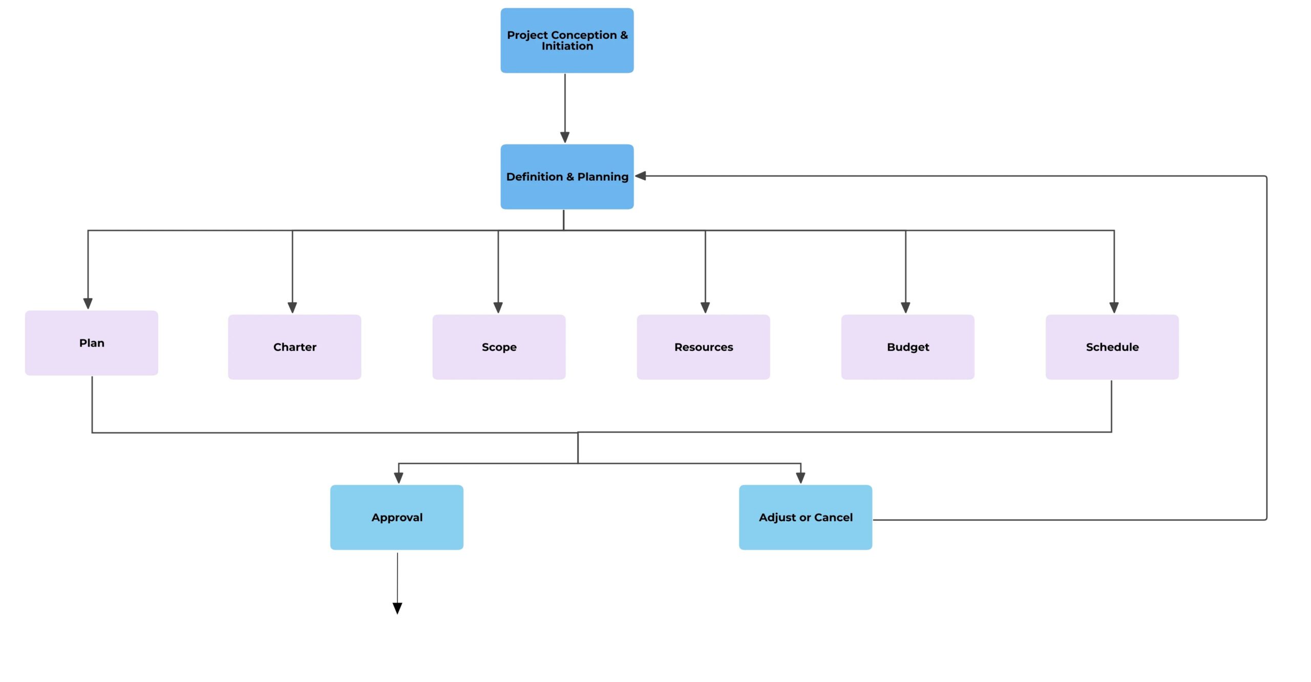
Before we jump into creating graphs, it’s important to understand why we use them. Project management graphs aren’t just pretty pictures; they’re powerful communication tools. They allow project managers, teams, and stakeholders to quickly see the status of a project, identify any potential problems, and plan for future work. A good graph can show:
- What tasks need to be done
- Who is responsible for each task
- When tasks start and end
- How tasks relate to each other (dependencies)
- If the project is on schedule or behind
- The project’s critical path
By visualizing information in this way, everyone gets a clear and shared understanding of the project. This means fewer misunderstandings and more efficient work.
Types of Project Management Graphs
There are many ways to visualize project information, each with its own strengths. Here are some of the most common types:
Gantt Charts
Gantt charts are probably the most popular project management graph. They use horizontal bars to represent the start, duration, and finish of tasks. Think of it as a timeline for your project. Here’s what you usually find on a Gantt chart:
- Task names: Listed on the left side of the chart.
- Time scale: Usually displayed across the top, showing days, weeks, or months.
- Bars: Representing each task’s duration.
- Milestones: Key dates or achievements marked on the timeline.
Gantt charts make it easy to see when tasks are scheduled to happen and how long they will take. They also help you spot potential schedule conflicts.
Network Diagrams
Network diagrams show the relationships between tasks. They illustrate which tasks must be finished before others can begin. There are two main types of network diagrams:
Activity-on-Arrow (AOA) Diagrams
In AOA diagrams, the arrows represent the project activities, and the nodes (circles) represent the events or milestones. AOA diagrams can be a bit more difficult to read if you’re new to project management, but they show task dependencies very clearly.
Activity-on-Node (AON) Diagrams
In AON diagrams, the nodes represent the activities, and the arrows show the relationships or dependencies. AON diagrams are generally more intuitive and easier to follow. Most modern project management software uses this approach.
Network diagrams are useful for finding the critical path of a project, that is the sequence of tasks that determines the overall project completion time. If any task on the critical path is delayed, the whole project will be delayed.
PERT Charts
PERT (Program Evaluation and Review Technique) charts are very similar to network diagrams, but they also include estimates for task times. They use three time estimates:
- Optimistic time: The shortest possible time to complete the task.
- Most likely time: The time the task would usually take.
- Pessimistic time: The longest possible time to complete the task, assuming things don’t go smoothly.
PERT charts help in projects where there is a great deal of uncertainty, such as research or development projects. They give you a clearer picture of the range of possible timelines and help you plan accordingly.
Other Charts and Graphs
Besides the main charts, here are some other useful project visualizations:
- Burn-Down Charts: Shows the amount of work remaining over time, great for tracking progress in agile projects.
- Histograms: Used to visualize the distribution of project data, like the number of hours worked by resource.
- Pie Charts: Useful for showing percentage breakdowns, for example resource allocation or project budget distribution.
Steps to Creating a Project Management Graph
Now that we know different types of graphs, let’s talk about how to create them. Here’s a step-by-step approach:
Step 1: Define Your Project
Before you create a graph, you need to understand your project. This includes:
- Project goals: What are you trying to achieve?
- Project scope: What work needs to be done?
- Project deliverables: What are the tangible results of the project?
- Project timeline: When does the project need to be finished?
Having a clear understanding of your project will make it much easier to create an accurate and useful project graph.
Step 2: Break Down the Work
Once you know your project, you need to divide it into smaller, more manageable pieces. This is called creating a work breakdown structure (WBS). Think of it like an outline for your project. Each task should be clear and specific.
For example, if your project is “Build a Website”, some tasks might be:
- Design the homepage
- Create the product pages
- Write website content
- Test website functionality
Breaking down tasks in this way makes the project less overwhelming and easier to plan.
Step 3: Determine Task Dependencies
Task dependencies are the relationships between different tasks. Some tasks can’t start until others have finished. Understanding these dependencies is very important for accurate project planning. Here are some common types of dependencies:
- Finish-to-start (FS): Task B can’t start until Task A finishes.
- Start-to-start (SS): Task B can’t start until Task A starts.
- Finish-to-finish (FF): Task B can’t finish until Task A finishes.
- Start-to-finish (SF): Task B can’t finish until Task A starts (This one is less common).
Identifying dependencies helps you schedule tasks in the right order, preventing delays and ensuring smooth project flow.
Step 4: Estimate Task Durations
For each task, you need to estimate how long it will take to complete. This might be based on past experience, expert opinion, or historical data. Be sure to consider that unexpected events or challenges could happen, so it’s good practice to add a little extra time for possible delays.
Consider using these tips for estimating:
- Use historical data: Look back at similar projects to see how long tasks took in the past.
- Consult team members: Ask those who will be doing the work for their input on realistic time frames.
- Use a range: Give an optimistic, most likely, and pessimistic time for each task. This is used in PERT chart creation.
Remember, an accurate estimate is vital for a good schedule, but it doesn’t have to be perfect. You can always make adjustments later in the project.
Step 5: Choose Your Tool
There are many tools you can use to create project management graphs. Here are a few options:
Manual Creation
You can create simple Gantt charts and network diagrams using just paper and pen, or a whiteboard. This works for smaller, simple projects. You can use free tools like Google Sheets or Microsoft Excel to create basic graphs. This might be a good starting place if you’re just learning the concept.
Project Management Software
For larger, more complex projects, project management software is a much better choice. These software solutions have features for creating, updating, and managing graphs automatically. Here are some popular software options:
- Microsoft Project: Popular for enterprise-level projects.
- Asana: Good for teams and project collaboration.
- Trello: Simple and flexible for Kanban-style projects.
- Monday.com: Offers many project visualization options.
- Wrike: Focuses on collaborative work management.
The best tool for you will depend on the size and complexity of your project, your budget, and your team’s needs. Most project management software offers a free trial period, so you can try out a few before making your decision.
Step 6: Create Your Graph
Once you’ve gathered all your data and chosen your tool, it’s time to create your graph. If you’re using software, the process will be straightforward, because most tools have built in features for graph creation. Here’s a general guide on what you should do:
- Input tasks: Add all the tasks to your chosen tool or paper.
- Set durations: Specify how long each task should take.
- Define dependencies: Show how tasks are related to each other.
- Assign resources: If needed, assign team members to tasks.
- Add milestones: Mark important dates in the timeline.
- Review and adjust: Make sure your graph accurately reflects your plan.
Your tool will generate the graph, whether it’s a Gantt chart, network diagram, or PERT chart. Make adjustments as needed to get a clear, accurate visual.
Step 7: Use and Update Your Graph
A project management graph is not a static document. It should be used actively throughout the project. As the project progresses, things may change. You’ll need to update the graph to reflect:
- Completed tasks
- Changes in task durations
- New tasks
- Shifts in dependencies
- Any problems or delays that may have occurred
Regularly check your graph and adjust it as needed. Keeping your graph up-to-date will make sure it continues to be an accurate reflection of your project’s status.
Tips for Effective Project Management Graphs
Here are some tips to make your project management graphs effective:
- Keep it simple: Use clear and understandable language. Avoid unnecessary details.
- Use color-coding: This helps to distinguish different types of tasks or statuses.
- Use milestones: Highlight key project dates and achievements.
- Communicate with your team: Share the graph with your team so everyone is on the same page.
- Update regularly: Keep your graph current. Stale data isn’t useful for project planning.
- Use the right type of graph: Make sure you are using the best type of chart or graph for your project needs.
By following these tips, you’ll create project management graphs that not only look good but are also really useful for managing your projects.
Creating useful project management graphs is an important skill for anyone working on projects. Whether you’re leading a large team or managing a small personal project, these visual tools help you stay organized, track progress, and communicate effectively. Don’t be afraid to explore different types of graphs and find what works best for your particular needs. With a bit of practice, you’ll soon be able to create graphs that help you reach your project goals successfully.
Gantt Charts, Simplified – Project Management Training
Final Thoughts
Creating project management graphs involves choosing the right type, like Gantt or PERT charts. Input your task data, including dependencies and timelines. Use software or draw it manually. Regularly update the graph to reflect project progress. Understanding how to make project management graph is key for successful execution.
These visual aids clarify complex schedules. They allow you to track progress, identify potential issues, and manage resources. A well-maintained graph ensures everyone stays informed.