A Burndown chart visually tracks the remaining work against time, showing progress towards completing a project or sprint.
Ever feel lost in a project, wondering if you’ll actually finish on time? A Burndown chart offers a clear, graphical way to see how your team is progressing. This simple yet powerful tool helps you monitor work remaining and identify potential roadblocks. It’s a crucial component in agile project management.
By visualizing the ideal pace compared to the actual work completed, you can quickly adjust your strategy, ensuring timely delivery. The Burndown chart provides transparency and accountability for the whole team. This visual approach keeps everyone on the same page, reducing confusion and improving focus.

Understanding the Power of the Burndown Chart
Let’s dive deep into the world of project tracking with a powerful tool: the burndown chart. Imagine you’re building a really awesome Lego castle. You have a plan, lots of bricks, and you know how much time you have to finish. A burndown chart is like your progress report, showing how quickly you’re using up your bricks and getting closer to the finished castle. It’s a visual way to see if you’re on track or if you need to pick up the pace. In the world of project management, a burndown chart does the exact same thing, but instead of Lego bricks, we use tasks and time.
What Exactly is a Burndown Chart?
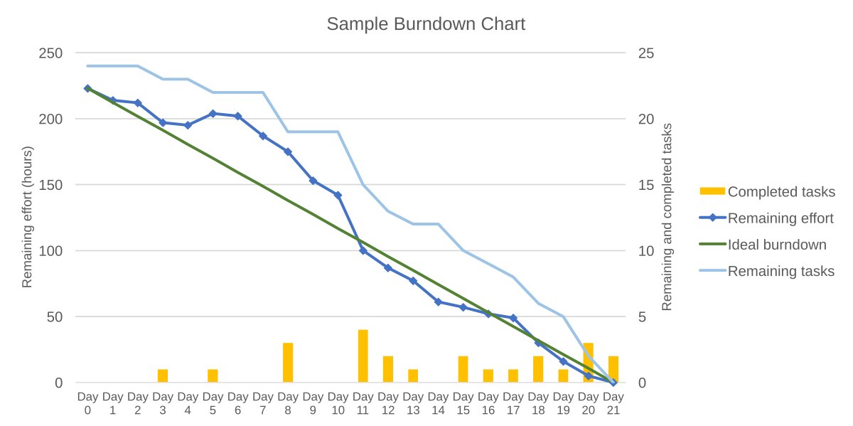
At its core, a burndown chart is a graph that shows how much work is left to do over a period of time. Think of it as a countdown timer for your project. The chart has two axes: the vertical axis typically represents the amount of work remaining (like the number of tasks or story points), and the horizontal axis shows the time (days, weeks, or sprints). The chart starts with all the work that needs to be done, and as time progresses, the line on the graph moves downward (or “burns down”) towards zero, signifying the completion of the work.
Key Components of a Burndown Chart
Let’s look at the main parts of a burndown chart, so we really get comfortable reading them:
- Ideal Line: This is a straight line that goes from the top-left corner to the bottom-right corner of the graph. It shows how the work would progress if everything went perfectly. This represents the ideal pace at which the team should complete the work.
- Actual Line: This wiggly line represents the actual work progress. It’s what actually happened, not what we planned to happen. This line usually doesn’t follow the ideal line exactly, sometimes being above (behind schedule) or below (ahead of schedule).
- Y-axis (Vertical): This represents the amount of work left to do. This could be measured in story points, hours, or number of tasks.
- X-axis (Horizontal): This represents the time period for the project or iteration, like days, sprints, or weeks.
Why Use a Burndown Chart?
Burndown charts are fantastic for several reasons. They provide quick insights into project progress, help identify potential issues early on, and help with team communication. They’re a visual way to see what’s happening, so everyone involved in the project can quickly understand the status without needing a lengthy report.
Benefits of Using a Burndown Chart:
- Easy to Understand Progress: The visual nature of a burndown chart makes it easy for everyone to see how the project is progressing. You don’t need to read long reports to understand if the project is ahead or behind schedule.
- Early Issue Detection: If the actual line consistently stays above the ideal line, it is a clear signal that there are issues and that you are not progressing as planned. This allows the project team to address challenges early before they cause significant delays.
- Enhanced Communication: Burndown charts make it easy for the team members, stakeholders, and anyone else involved to have clear conversations about project progress. It helps keep everyone on the same page.
- Improved Planning: By analyzing the burndown chart data, teams can get a better understanding of their work capacity and make more accurate plans for future projects. It helps them plan based on their ability rather than just hopes.
- Motivating Tool: Seeing the actual line “burn down” toward the bottom can be very motivating for the team. It shows visible progress and can build confidence that they will reach their goal.
How to Create a Burndown Chart
Creating a burndown chart is pretty simple. Here’s a step-by-step guide to get you started.
Steps to Create a Burndown Chart
- Determine the Scope: First, figure out the total work that needs to be done. This can be represented as tasks, story points, hours or any other unit that works for the project.
- Set the Time Frame: Define the duration of the project or iteration (sprint). This is typically measured in days, weeks or sprints.
- Track Work Completion: As the project progresses, keep track of the work that is completed on a daily or regular basis. Update the chart by marking the remaining work in appropriate intervals.
- Plot the Points: Plot the remaining work on the chart, each point representing the work left at a given time.
- Draw the Lines: Connect the points to form the actual line. You should also draw the ideal line to show the intended pace of the project.
- Analyze and Adjust: Regularly review the chart to see if you’re on track. If not, make adjustments to your work plan.
Interpreting a Burndown Chart
So, you have a burndown chart, but what does it all mean? Let’s look at a few common scenarios:
Common Scenarios
- Ideal Line and Actual Line Match Closely: Great! This means that you are progressing as planned and are on track to meet the deadline.
- Actual Line Above Ideal Line: Uh oh! This indicates that your progress is slower than expected. You might be falling behind schedule, and you need to identify the issue and adjust your process. This could mean that your work estimates were off, or unexpected events happened.
- Actual Line Below Ideal Line: This is great news! You are ahead of schedule. You may have underestimated the team’s capability or completed work faster than expected. This might mean you can finish early.
- Flat Actual Line: If the actual line is flat for a while, it indicates that you aren’t making progress. You need to figure out why nothing is being completed. This might mean there is a blocker or issue that needs to be addressed.
- Spikes in the Actual Line: Spikes, or sudden jumps upwards in the line, show that previously finished tasks are being added back or if the scope of work has increased. It indicates significant changes in the work plan, scope creep, or potentially some tasks were not really completed.
Burndown Charts in Agile
Burndown charts are extremely popular within Agile project management. In Scrum, for example, they are frequently used to track progress within sprints. Each sprint has a specific goal, and the burndown chart helps to see how the team is moving towards that goal. It provides a visual aid that helps the team to self-manage by keeping them informed about the actual vs planned progress of the sprint.
Sprint Burndown Chart
In Scrum, the burndown chart is usually referred to as a sprint burndown chart. The chart tracks the amount of work remaining within a specific sprint period, which typically lasts one to four weeks. This sprint burndown is used during daily stand-up meetings to discuss any roadblocks and how to get back on track.
Variations of Burndown Charts
While the basic concept of a burndown chart stays the same, there are several ways that they can be customized for different situations.
Burndown Chart Variations
- Release Burndown Chart: This is used for tracking progress on a whole project or release, not just a single sprint. It visualizes the overall progress against the planned release date. It provides a high-level overview to stakeholders.
- Cumulative Flow Diagram (CFD): While not strictly a burndown chart, a CFD is sometimes used together. CFDs are more complex but provide insight into how work flows through the system by showing each task status, like ‘to do’, ‘in progress’, or ‘completed.’ It is helpful to identify bottlenecks in the workflow.
- Ideal Burndown Line Customization: Some teams might use a more curved ideal line instead of a straight line to reflect that the work is not necessarily performed at the same pace throughout the duration of the project or sprint. For example, the ideal line might flatten out in the middle to signify some time is spent on reviewing and quality testing.
- Burnup Chart: Instead of showing the remaining work, a burnup chart shows the total completed work over time. The aim is to reach the total work scope in the project timeline. It’s useful for understanding how quickly work is being completed.
Tools for Creating Burndown Charts
You don’t have to draw your burndown charts by hand! Many project management tools offer built-in burndown chart functionality. These tools automatically track your progress and create the charts for you. This can save you a lot of time and effort. Some of the popular ones are :
- Jira: A widely used project management tool that is a favorite among agile teams.
- Trello: Another flexible tool that integrates with other project management tools.
- Asana: An easy-to-use tool that is popular for team projects.
- Microsoft Project: A long standing tool for project managers.
- Excel/Google Sheets: You can also create burndown charts using spreadsheets.
Best Practices for Using Burndown Charts
Here are some things you should keep in mind to use burndown charts effectively:
- Regular Updates: Keep the chart updated regularly, don’t wait for a long time to update the progress. Daily is ideal for agile sprints, but you might use a different time frame for longer projects.
- Accurate Estimates: Use realistic and accurate work estimations. Poor estimations will make your chart useless and lead to bad decisions.
- Team Involvement: Ensure the whole team understands what the burndown chart shows. Let them contribute to the chart by being honest about progress.
- Address Roadblocks: If the chart indicates issues, discuss and address the roadblocks immediately. Don’t ignore problems, take action.
- Adapt as Necessary: Be flexible and adjust your plans, if needed. If the burndown chart shows a problem, don’t be afraid to make changes.
Common Mistakes to Avoid
Here are some mistakes people sometimes make with burndown charts:
- Ignoring the Chart: Creating a chart and then not using it is a complete waste of time. You must look at it regularly and discuss findings with the team.
- Forgetting Updates: If you only update the chart at the end of a sprint, the tool will not be useful to resolve issues in between. Regular updates are critical.
- Being Afraid to Adjust: Remember, the plan is only a guide, and if something comes up, adjust your plan. A burndown chart is there to help you, not to restrict you.
- Adding Scope Secretly: If new tasks are added without adjusting the chart and scope, this makes the chart inaccurate and misleading.
Burndown Charts for Personal Use
Believe it or not, you don’t have to be a project manager to take advantage of a burndown chart. They can be really useful for tracking personal goals or tasks too. For example, you can use a burndown chart to track your progress towards finishing your homework, reading books, or even working out!
Example: Personal Goal Tracking
Let’s say you want to read five books in a month. Create a simple burndown chart, where the Y-axis represents the number of books remaining and the X-axis represents the days of the month. Each time you finish reading a book, update the chart. This will help you see if you are on track to reach your goal.
The Burndown Chart: A Key Project Tool
Burndown charts are a simple but valuable tool for managing projects and tasks. They provide a clear visual of project progress, help in identifying issues early, and allow teams to make informed decisions. By understanding how burndown charts work and implementing best practices, you can significantly improve project management and achieve your goals on time and within budget. They are a great help in keeping everyone aware of progress. Whether it’s tracking a multi-million dollar project or your personal reading goals, burndown charts can be your secret tool for getting to the finish line successfully. They help turn a complex project into a simple-to-follow chart, making the journey clearer and more manageable.
What are a Burndown Chart, a Burnup Chart, and Velocity?
Final Thoughts
The burndown chart provides a visual representation of work progress. Teams can track their remaining tasks against time. This tool aids in identifying potential delays and keeping projects on schedule. Therefore, consistent monitoring of the burndown chart will improve the project’s predictability.
Use the burndown chart to understand your team’s velocity. This helps you refine future sprint planning. Overall, this simple graph makes project management more transparent and effective.